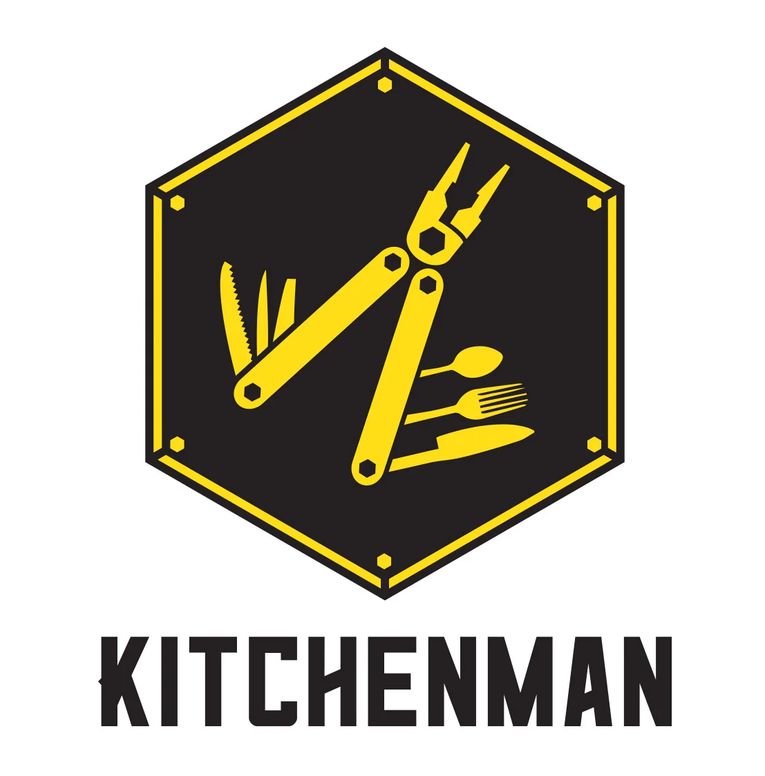
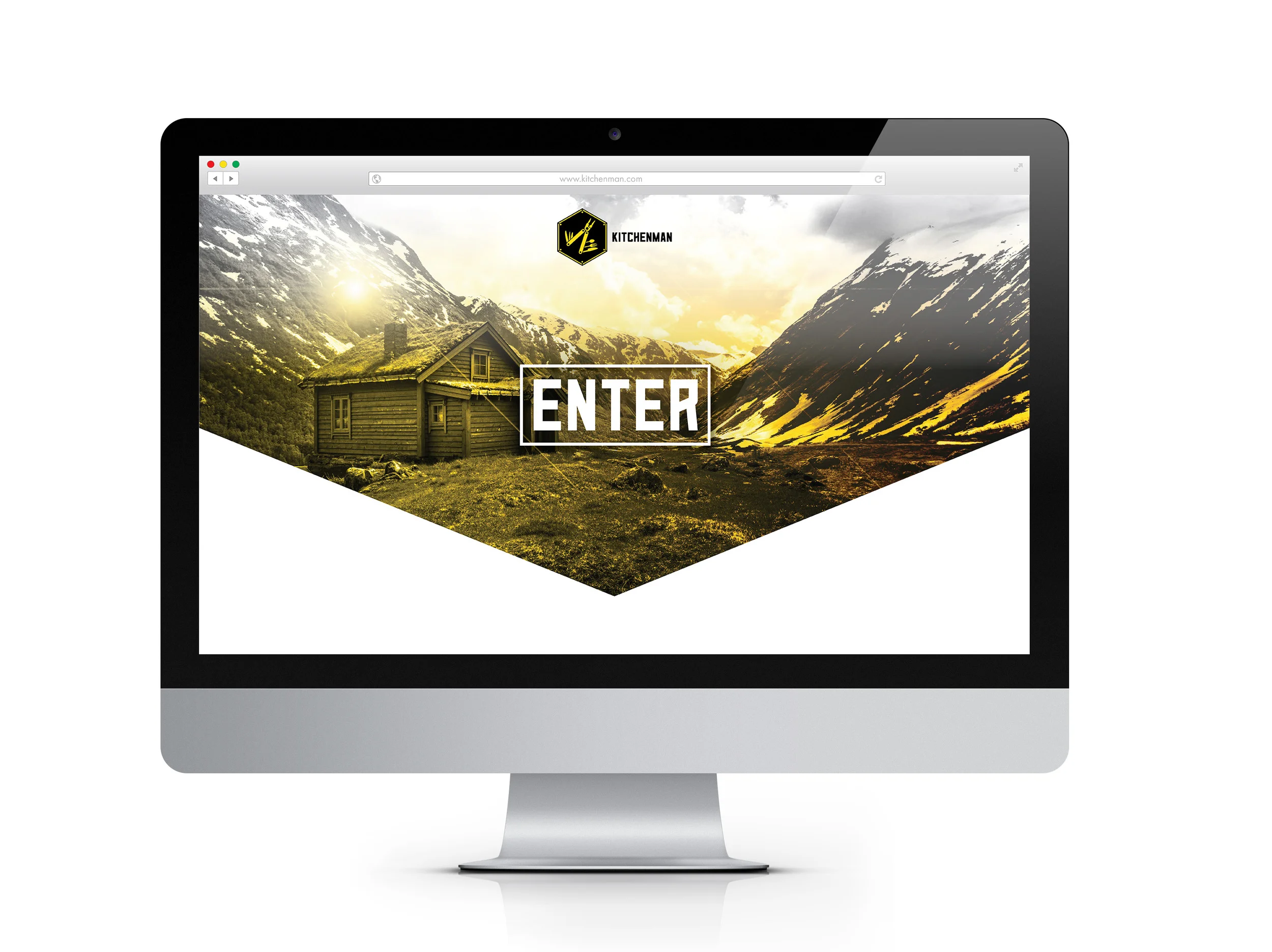
Kitchenman is a merger between Kitchenaid applicances and Leatherman multi-tools. I chose to create a product that was similar to the Leatherman that would also include basic cooking utensils such as a fork, knife and a spoon. For this project I designed the logo, letterhead, business card, enveloope, packaging for the product, promotional posters, website, and also transportation in the form of a tractor trailer and a corporate jet.
The Honor, Courage, Respect Newsletter was developed to shed light on the Wounded Warrior Project and all they do to help the wounded veterans of America. The content of this newsletter features positive stories of courage, hope, honor, and respect.
This newsletter was printed and bound together like any other newsletter.
The Drive Thru is a branding project based on an existing business with an added twist. The company is based off of Stop & Go Drive Thru that is located in Ottumwa, IA. The store in Ottumwa sells anything that a conveniece store would with the convenience of driving through instead of having to get out of your car. However, the brand that I’ve developed also allows customers to have gasoline pumped in their car, as well as an optional oil change if need be.
These two NASCAR paint schemes were designed to be concepts for driver Dale Earnhardt Jr. This project focused on photoshop and illustration techniques. The sponsors that appear on the cars are actual sponsors of the #88 team and I wanted to portray these paint schemes to be as authentic as the real cars that are seen on the track each weekend.
My uncle Tony passed away due to a brain aneurysm in 2010. Since then, I've designed the logo, t-shirt, and koozie for a memorial golf outing that we've held every year since his passing. This is the collateral that I designed for the 2015 outing.
During the fall of 2015 I had the chance to work on a downtown revitalization project where I visited Sheldon, Iowa to re-design a storefront for Carl's Footwear. I was assigned Carl's and the rest of our class was assisgned various other businesses in the downtown district. I started with the logo, and eventually added windown signage, exterior lighting, and way finding footprints to help invite customers to check out the the store. Here is a day and night illlustration of my final rendering of Carl's Footwear.
This short term identity is for a hypothetical Little League Summer Camp. This project features a business letter, envelope, business cards, a series of 3 posters, a tri-fold brochure, two 3-D applications (t-shirts/hat/light pole banners), and a website.
Here are a few logos and miscellaneous projects that I’ve worked on recently.
This info graphic was designed to be 2'x4' and features information about self serve car washes, a topic in which not a whole lot of people notice. I took my own photos of myself throughout the different processes while at the car wash. The information is based on the basics and overall information about pricing, payment methods, and the functions of the car wash.
This two page spread was done for Trend Magazine, which is a student run magazine at Iowa State University. The images and body copy were provided, and it was up to myself and the other designers in the club to come up with the design and layout of the pages based on one style guide.
This project focused on using the gradient mesh tool in Adobe Illustrator along with the pen tool to create the shapes. I started with initial sketches of the shaver drawn from 20 different angles. I then proceeded to take photos of these 20 angles. The next step was to re-create the shaver in Illustrator. I used the pen tool to draw out the different parts, then used the gradient mesh tool to fill in those parts with color.
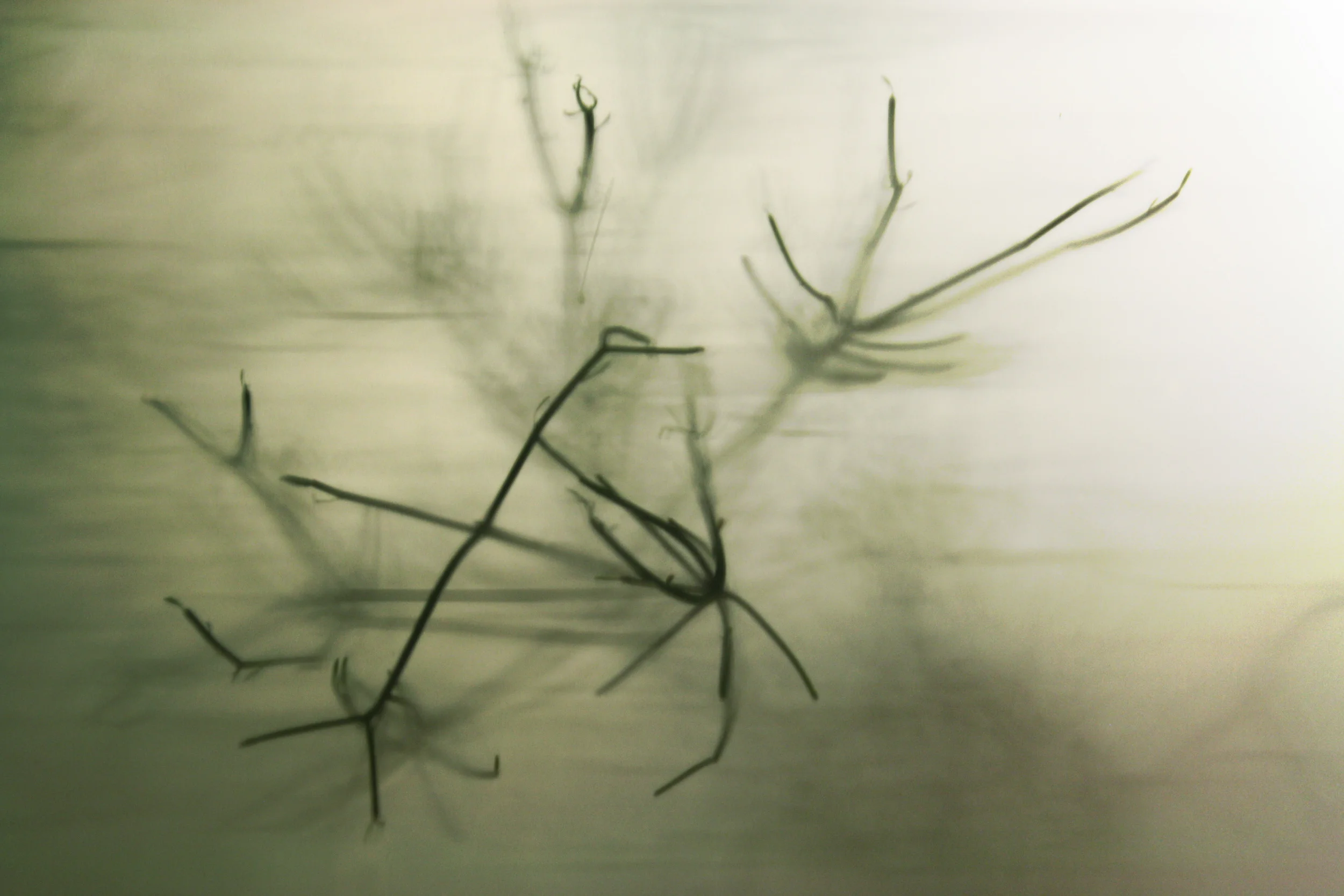
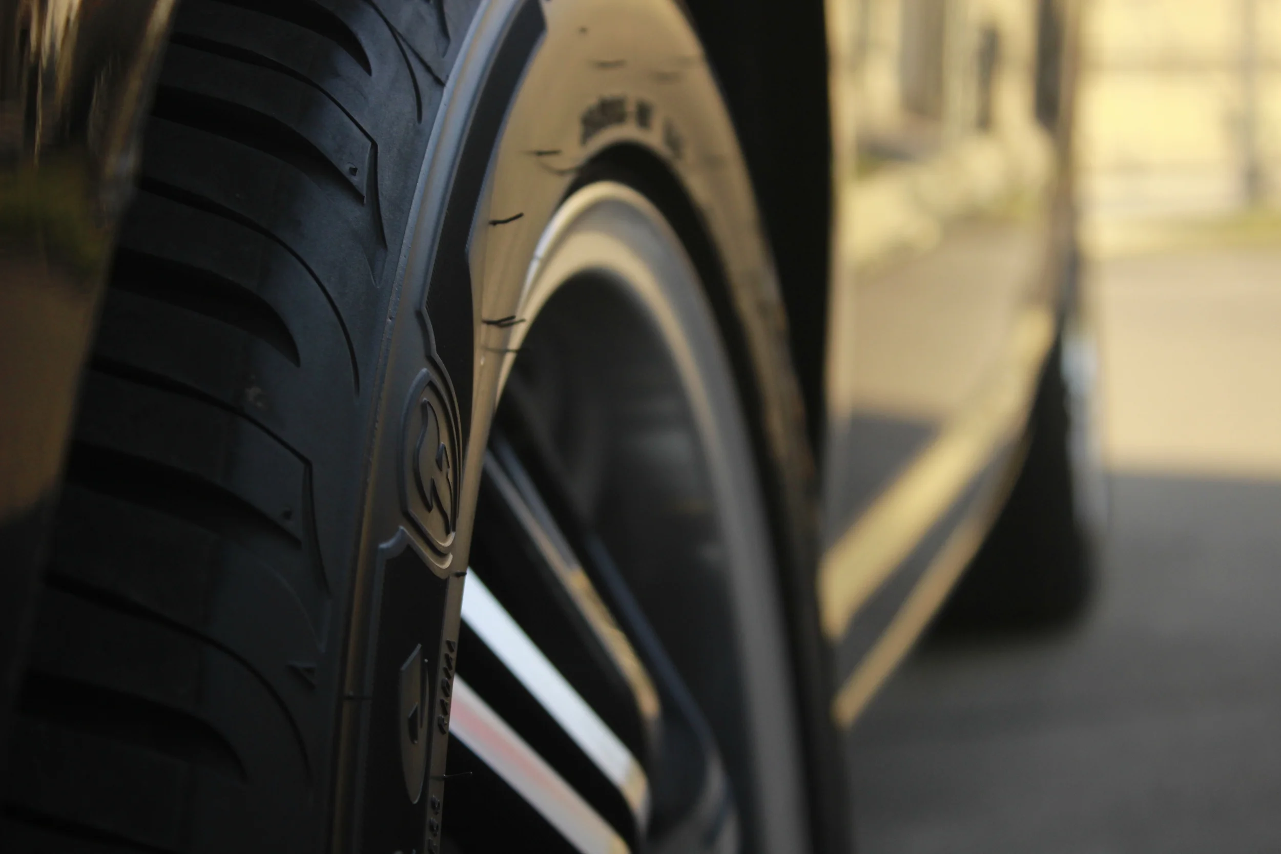
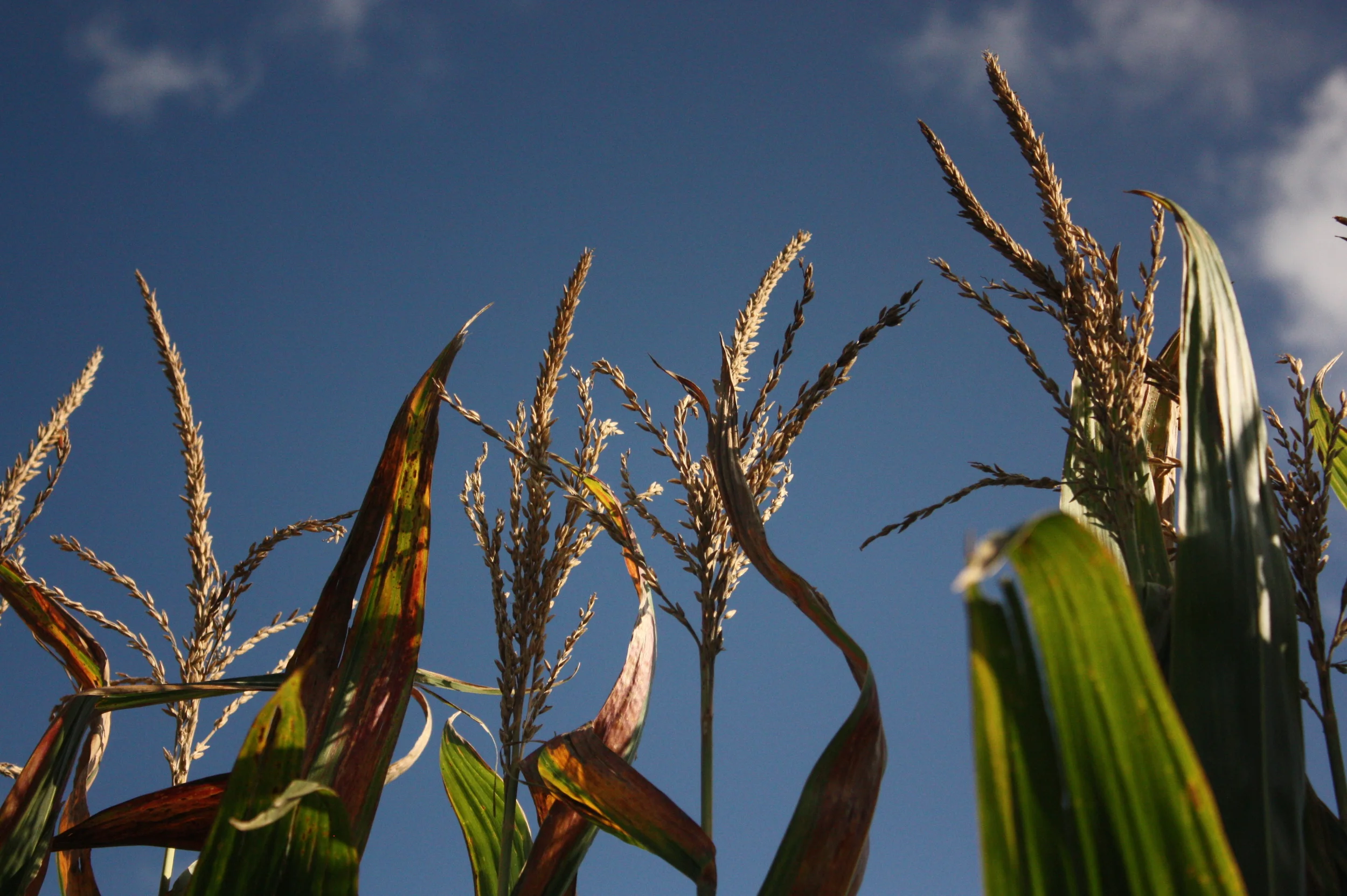
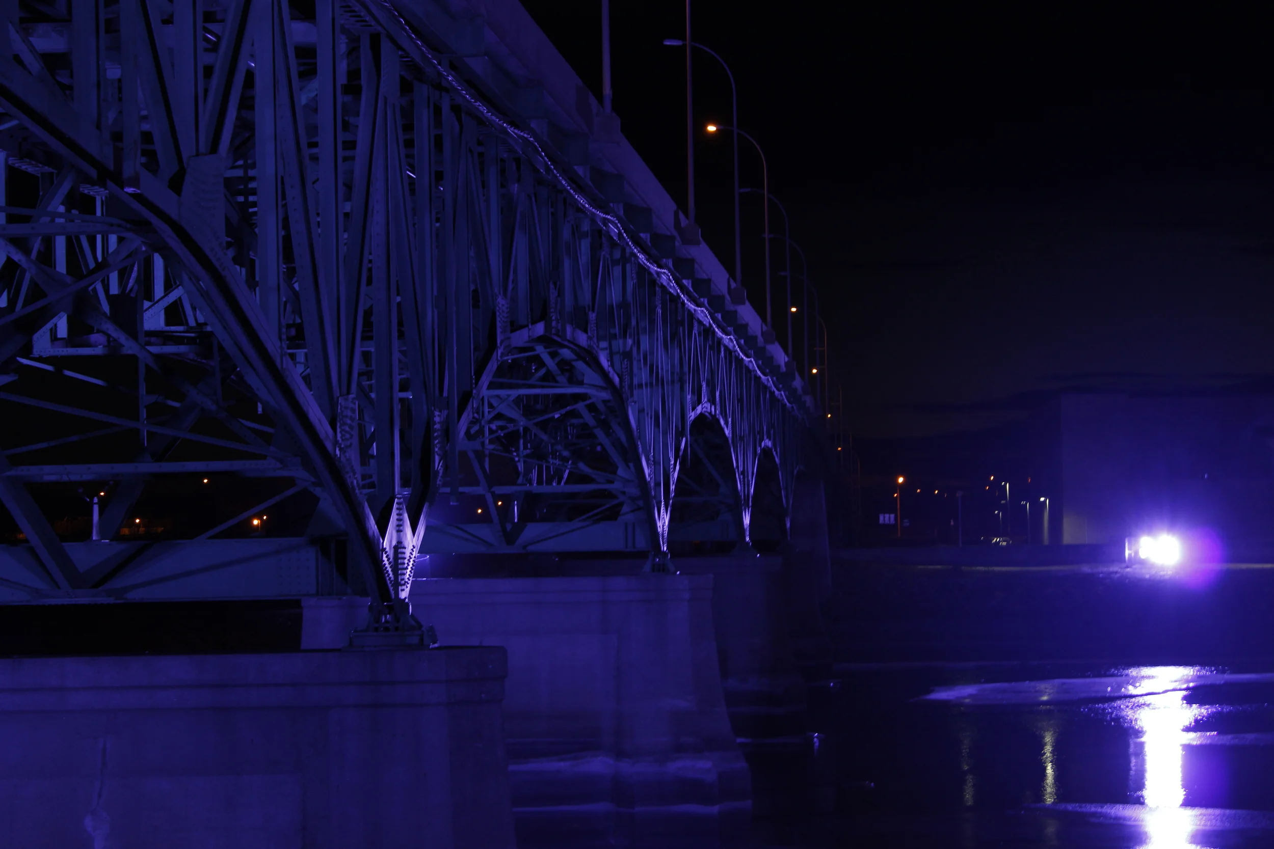
Here is a collection of some of my best photography. Although it is a hobby of mine, photography is something that I am passionate about, and hope to get better at as I grow as a designer.